The Canada we see on bank notes
Canadians have long identified with their regional landscapes—and not only for the natural resources found in them.
In the mid-1950s, bank notes began to reflect this identity by featuring engravings of Canada’s magnificent landscapes. And what’s on a bank note most often reflects how a nation perceives itself.
The 1954 note is Otter Falls on the Aishihik River near the Alaska Highway in the southwestern Yukon. The ’37 note may be a collage of real places but is otherwise fictional.
5 dollars, Canada, 1937 / 5 dollars, Canada, 1954
Take a look at these two bank notes
They both feature engravings of mountainous horizons with dense forests, rushing waterfalls and vast, cloud-studded skies. So, who’s the dreamboat on the ‘37 note? Actually, he never existed—he’s an allegory. That’s a fictional image that symbolically represents a concept. Allegorical figures were all the rage on old bank notes, representing such things as prosperity, trust, industry, progress, peace, justice, security and so on. And Mr. Dreamboat? He and his imaginary landscape are an allegory for hydroelectric power. The vignette on the ‘54 note, however, represents the land for its own sake, in all its undeniable beauty. It’s a bigger departure than appears on the surface.
A land of opportunity. A land of great beauty
These two notes represent vastly different attitudes toward the same thing. However, when the 1937 vignette was designed in 1935, the vision of Canada as simply a provider of resources and commercial opportunity was already getting old. The Second World War postponed plans for a new note series until the early 1950s, and by that time, the vision was downright elderly. The Bank of Canada was then determined to produce wholly modern notes that were Canadian in their style and imagery (though no Canadian portraits appeared on any of them—Just the Queen). The back design was bold and uncluttered, and the gorgeous vignettes showed a Canada little touched by human hands: a place of unspoiled natural beauty. That in itself may have been a bit of a fantasy, but, all the same, it expressed a new image of Canadians. It was an image of a people whose identity was tied to the land.
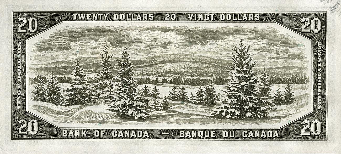
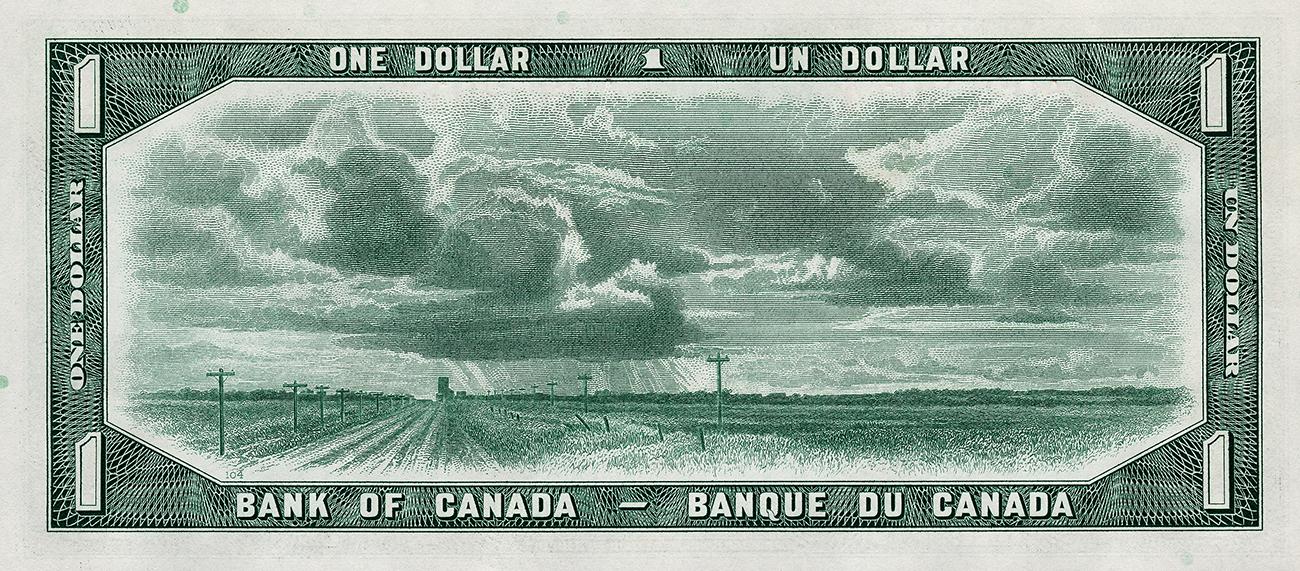
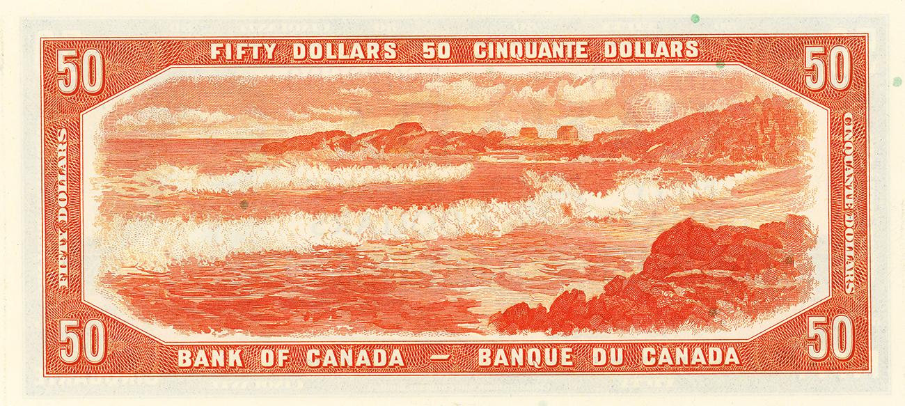


These views of the Laurentians, Saskatchewan and Nova Scotia show the cross-Canada diversity of the views chosen for the 1954 series. 20 dollars, Canada, 1954, NCC 1969.19.91 / 1 dollar, Canada, 1954, NCC 1965.43.1 / 50 dollars, Canada, 1954, NCC 1973.173.7
The human hand
Working this salmon fishing boat is an all-Indigenous crew from the Campbell River region of British Columbia. The engraver was George Gunderson, with final preparations by C. Gordon Yorke.
5 dollars, Canada, 1972, NCC 1972.0304.1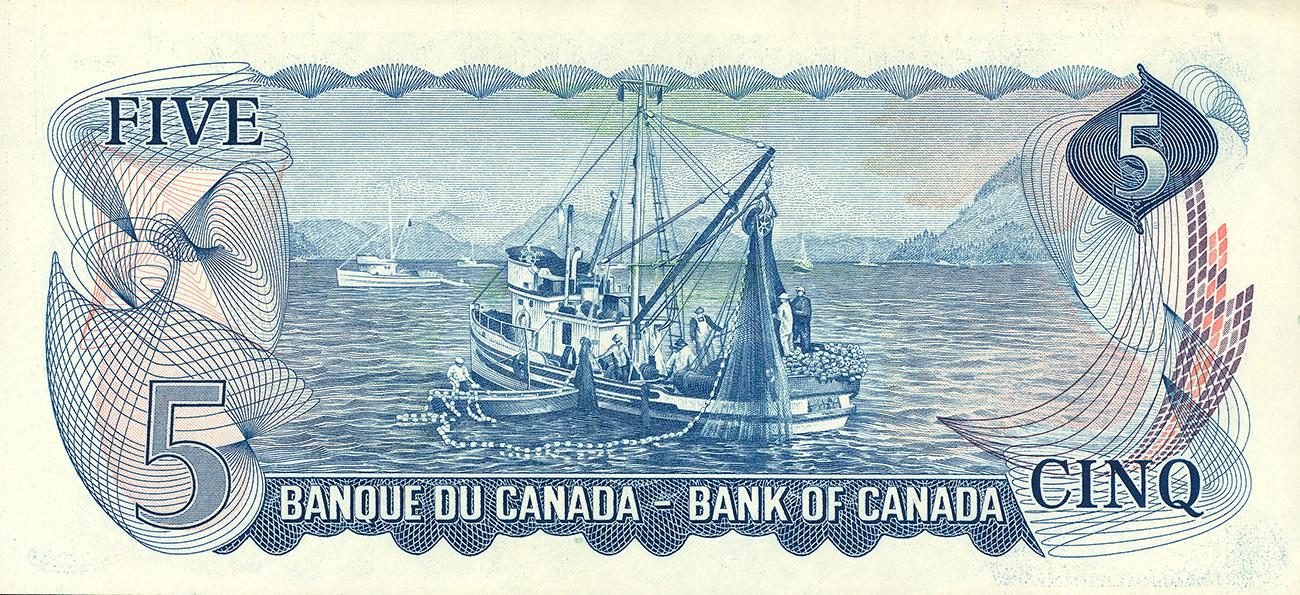
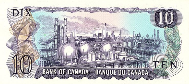
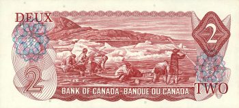
The series that followed in the mid-1960s and 1970s had a largely similar theme, though it was a more modern reflection of the land. Retaining the landscape subject but showing human activity and intervention transformed the imagery into an extended portrait of Canada and Canadians. The landscape and the people were conjoined. And the minutely detailed industrial facility on the 1971 $10 bill? Like it or not, it was a part of that modern Canadian landscape.
A Canadian habitat
The series that appeared in the mid-1980s was also, in its way, a landscape series. It’s quite common to see birds on bank notes. But, unusually, the Birds of Canada series showed vignettes of both the birds and their habitats covering the full width of the bank notes. The images were so roomy that the landscapes were almost as visually significant as the birds. Though none of these backdrops were likely specific places, they did create a broad vision of Canada, from its wetlands and rocky lakes to its meadows and tundra. Like the birds themselves, many of the views could be from almost any province. They provided a national vision of the Canadian landscape with a chance for a bit of regional identity.
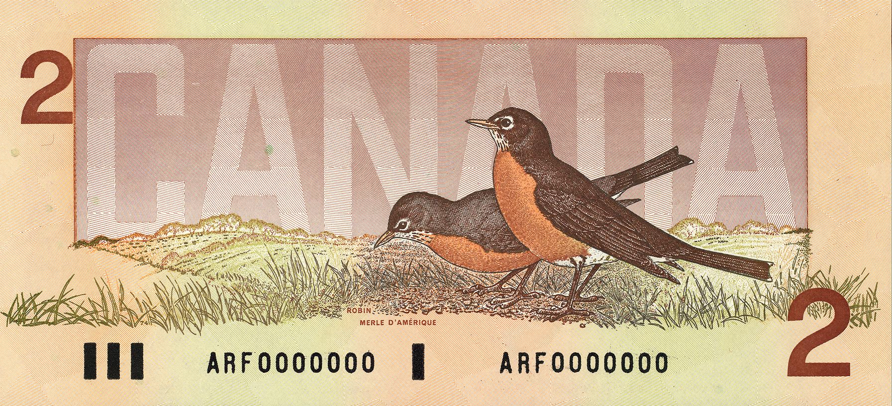
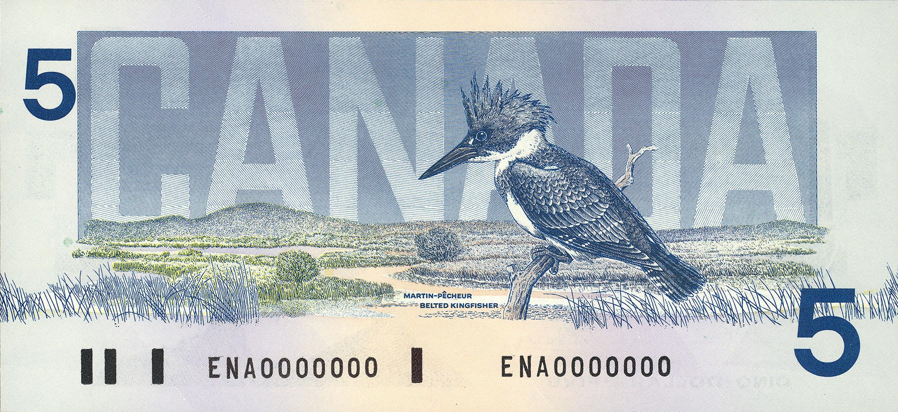
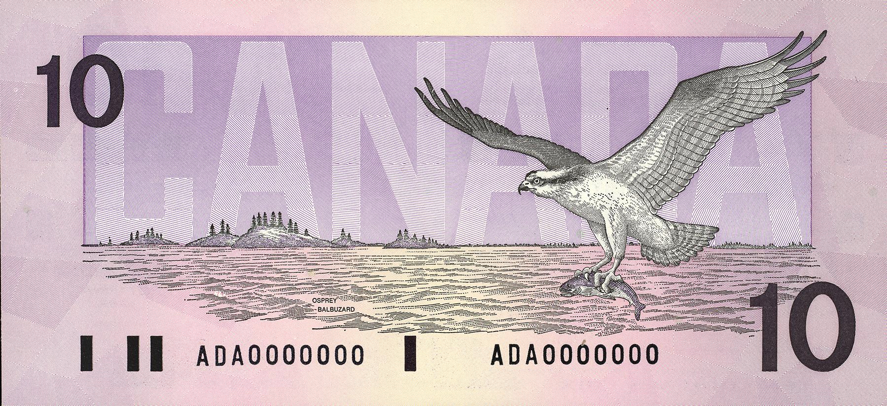
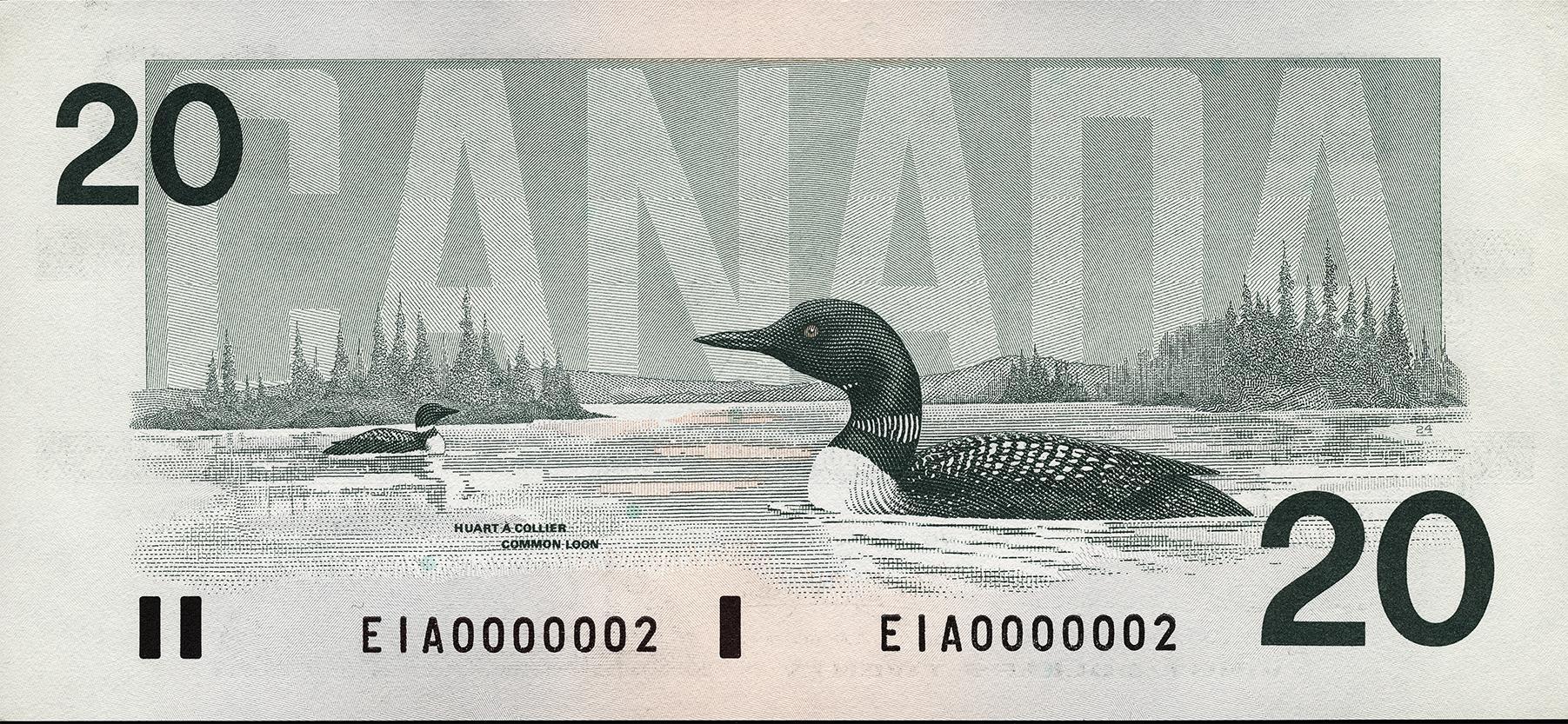
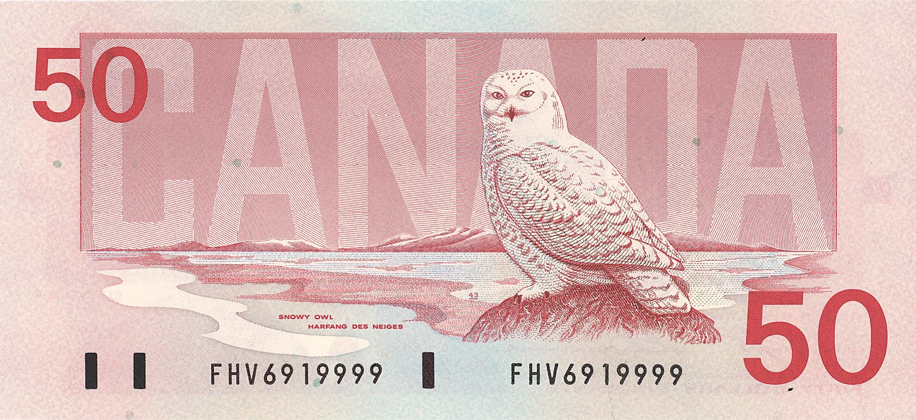
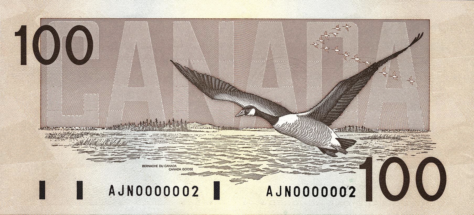
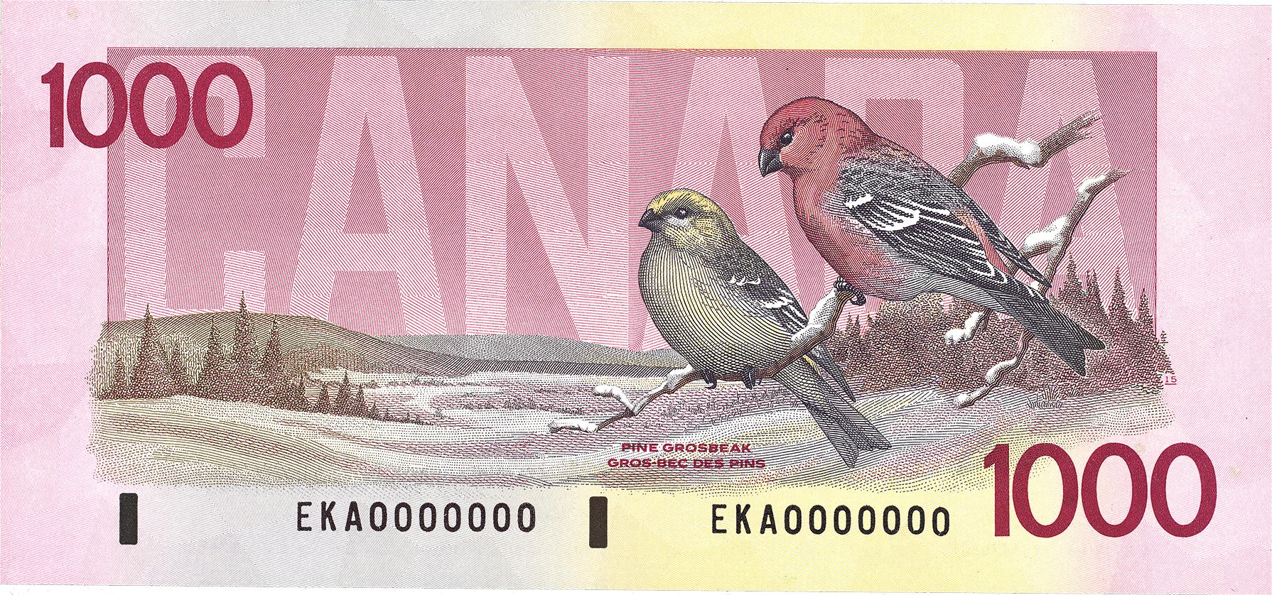


Birds were chosen for this series for their political neutrality and their potential to be simple, uncluttered images. This last was a security requirement of the day. Modern bank note security needs are quite different. 2 dollars, Canada, 1986, NCC 1986.42.3 / 5 dollars, Canada, 1986, NCC 1986.20.3 / 10 dollars, Canada, 1986, NCC 1989.37.11 / 20 dollars, Canada, 1986, NCC 1993.35.86 / 50 dollars, Canada, 1986, NCC 2002.9.17 /100 dollars, Canada, 1986, NCC 1990.44.10 / 1,000 dollars, Canada, 1986, NCC 1992.11.22
A note for all Canadians
Landscapes largely disappeared from our bank notes for the following two series. However, when the Bank chose to produce a commemorative note to celebrate Confederation’s 150th birthday, the public consultation process showed Canadians were keen to see landscapes on money again. In the past, note designers had an entire series of bills on which to showcase the land. This time, they had only one. It was a bit of a challenge.
The northern landscape is actually a skyscape: the dark sky preserve of Wood Buffalo National Park on the Alberta–Northwest Territories border.
10 dollars, Canada, 2017, NCC 2017.34.1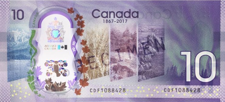
The five images spanning the back of this note roughly correspond to Canada’s geological regions. From left to right: the Coast Mountains, the Prairies, the Canadian Shield, the Atlantic Coast and the Northern Lights. Not only does this note manage to convey the highly varied Canadian landscape in five images, but the process of choosing appropriate scenery speaks of what might be an unofficial Canadian identity: a willingness to compromise.
The Museum Blog
A Curator’s Favourite Task
By: David Bergeron
How’re We Doing So Far?
By: Graham Iddon
Coin designs of Emanuel Hahn
By: David Bergeron
Our Grand Opening…
By: Graham Iddon
Museum Reconstruction - Part 8
By: Graham Iddon
