Model notes from the Canadian Journey series
Last fall, the Bank of Canada released Canada’s first vertical bank note, the $10 featuring Viola Desmond. But, it wasn’t the first time the Bank had considered a vertical format.
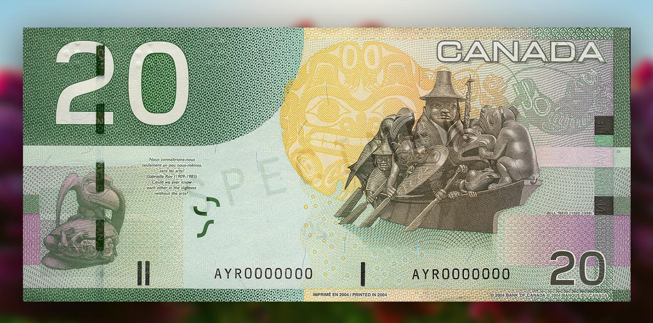
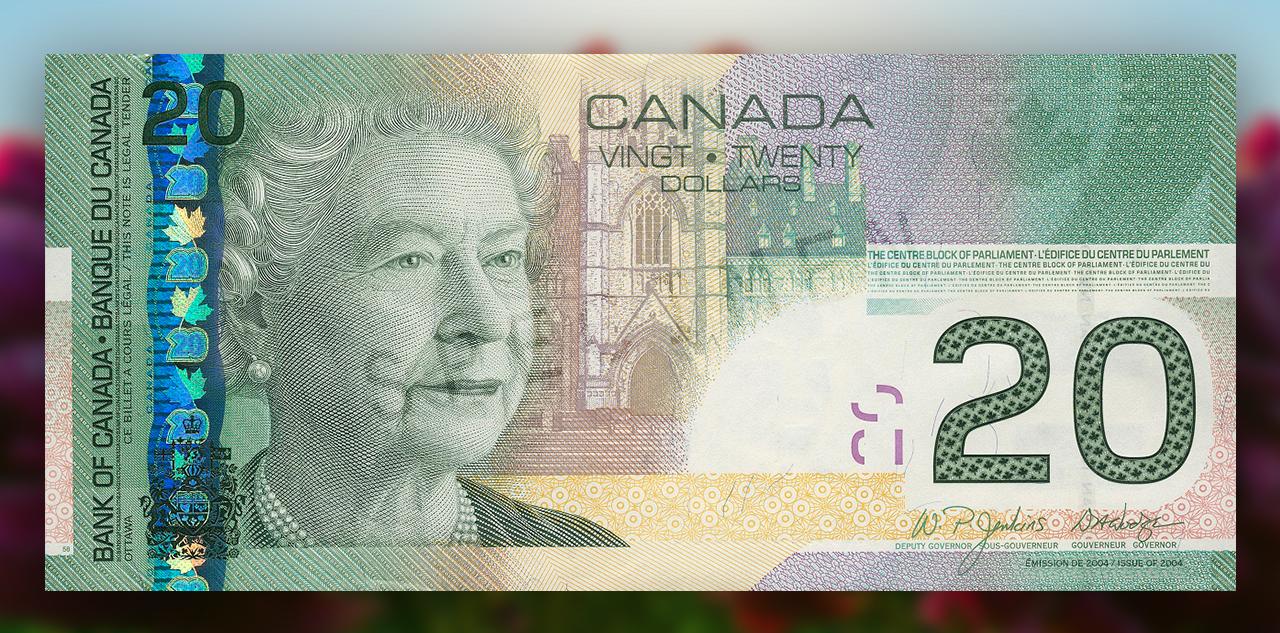


The Canadian Journey series $20, with its theme of arts and culture, won “Bank Note of the Year” in 2005 from the International Bank Note Society. $20, Canada, 2004
The Bank consults the public
Ask yourself a question. Just what is it about Canada or being a Canadian that’s most important to you? OK, now imagine expressing that on a bank note. Not so easy, eh?
In 1997, the Bank of Canada launched public consultations to find out what Canadians felt best represented them as a people and Canada as a place. Is it a person? A place? An animal? This was the first time Canadians were consulted on what appeared on their money. More than 4,000 people from a broad array of cultures and social groups provided their opinions. There were lots of calls for beavers and Mounties, of course. But participants also talked about Rocher Percé in Quebec, Confederation, Nellie McClung, personal freedoms, hockey, Louis Riel, peacekeepers, insulin—things they thought symbolized Canada both at home and for other nations.
Eventually, broad Canadian themes emerged that could be used to lay the foundation for a new note series: diversity, freedom, nature, history, activities, inventions and people. This last one ranged from individual achievers to generic traditional working types, such as the lumberjack or the fur trapper.
Identifying with nature
Every aspect of a new bank note goes through sometimes dozens of versions before a final design is chosen. Even the themes are works in progress.
The first theme tentatively settled upon for the new series was wildlife. After consulting with eminent naturalists, a number of animals were proposed—animals that were strongly associated with Canada, yet didn’t have any nasty, human-eating reputations (grizzlies: big and scary, otters: cute and fun).
At the same time, a short list of Canadian achievers was also established. The bank note design team put considerable thought into pairing the achievers with animals that might best represent them.
Pairing significant Canadians with wildlife
- Samuel de Champlain and a beaver
- Emily Carr and a big-horned sheep
- Lucy Maud Montgomery and a Canada goose
- Sir George-Étienne Cartier and a snowy owl
- Nellie McClung and a bear
- Tom Longboat and a wolf
However, then-Prime Minister Jean Chrétien chose to retain the prime ministers’ portraits on the new notes, but an animal was still chosen for the back of each denomination.
In October 1998, the design and thematic criteria were handed off to the security printing firms. Their design teams went to work and came back with a surprising result: vertical notes.
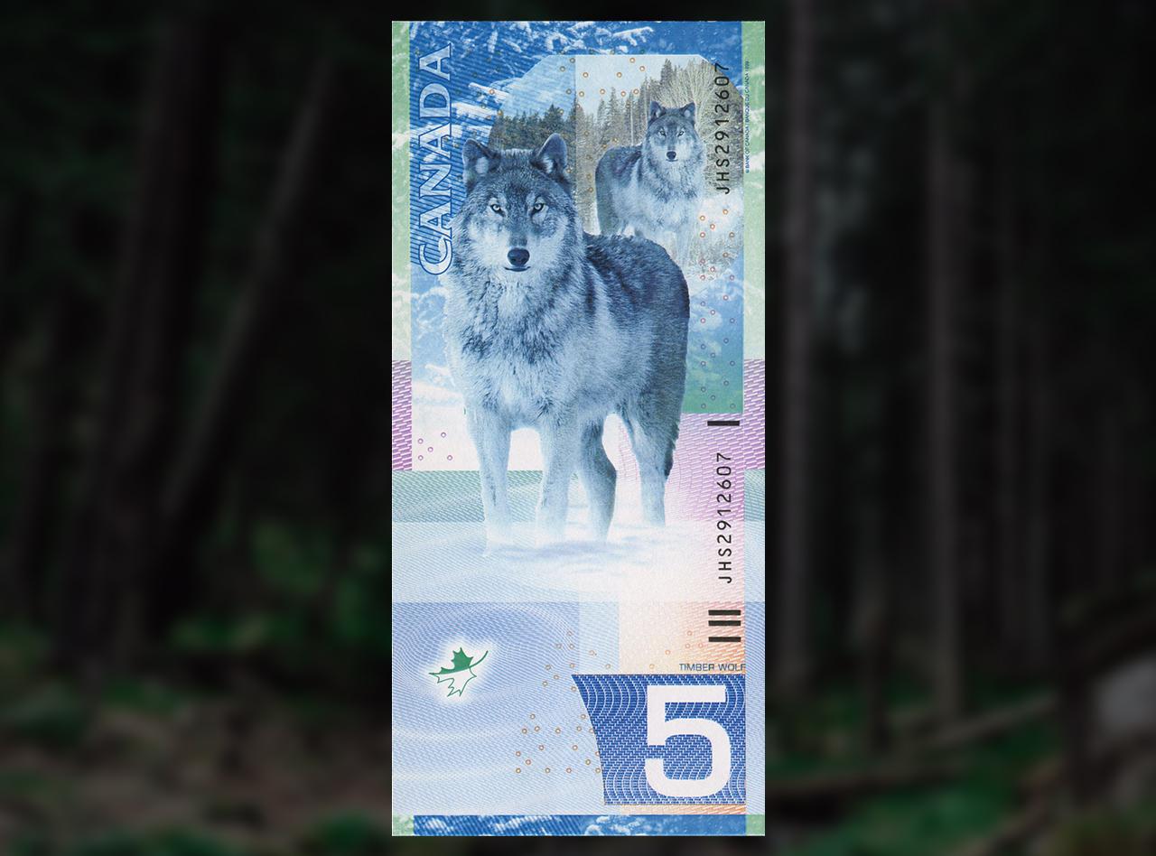

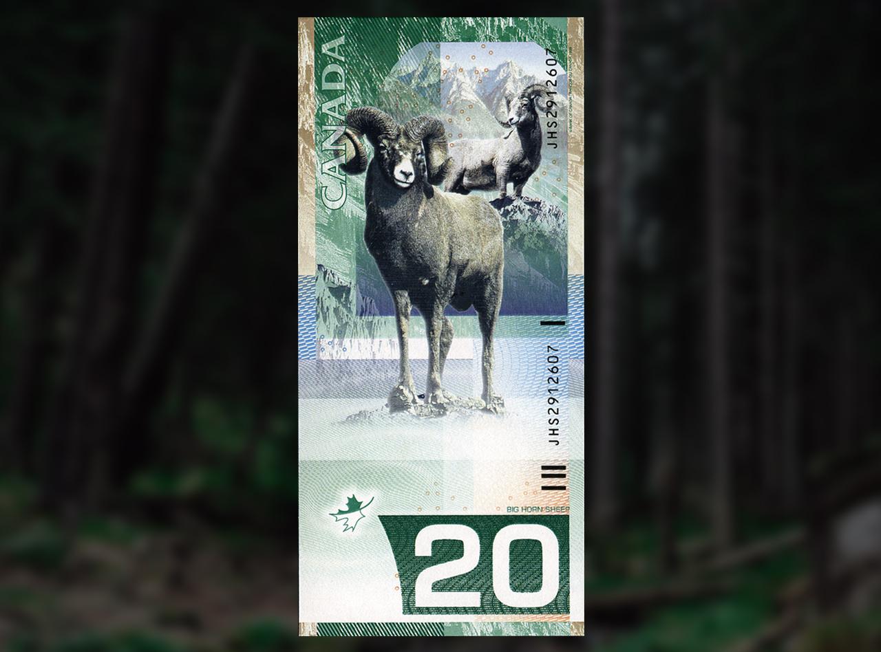


Canadian Bank Note Company art director Jorge Peral was the visionary behind this design. He is a very accomplished wildlife photographer as well as a master engraver. $5, $10, $20, bank note models, Canada, 2000
Designed by a team headed by Canadian Bank Note Company’s Jorge Peral, the set proposed was a complete departure from anything before seen in Canada. Though freshly modern, the fronts were essentially traditional bank note patterns. The backs of the notes, meanwhile, were anything but. Vertical notes had occasionally popped up in Europe, but on this side of the Atlantic, these proposed notes were indeed radical.
Bank note traditions are strong
But these notes were not to be. In the end, a horizontal format was chosen, and the wildlife theme was abandoned for a very different approach to Canadian identity. However, the face designs of Peral’s proposal were retained and further refined for the future series.




It is remarkable just how close the first proposed face pattern was to the final design. $10, bank note model, Canada, 2000 / $10, Canada, 2005
The wildlife subject certainly resulted in beautiful images, but the themes finally chosen for the new series were more reflective of a Canadian experience. The images of peacekeeping, children at play, innovation, exploration and social rights are the result of a bold undertaking to represent Canada and Canadians. When issued, they were considered by the Bank of Canada to be the most Canadian of our notes. And because the process was so successful, public consultation has since become an essential part of our bank note design process.

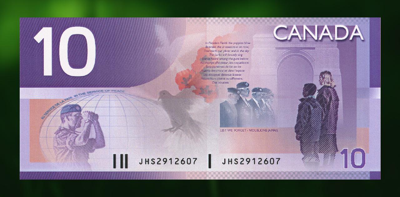
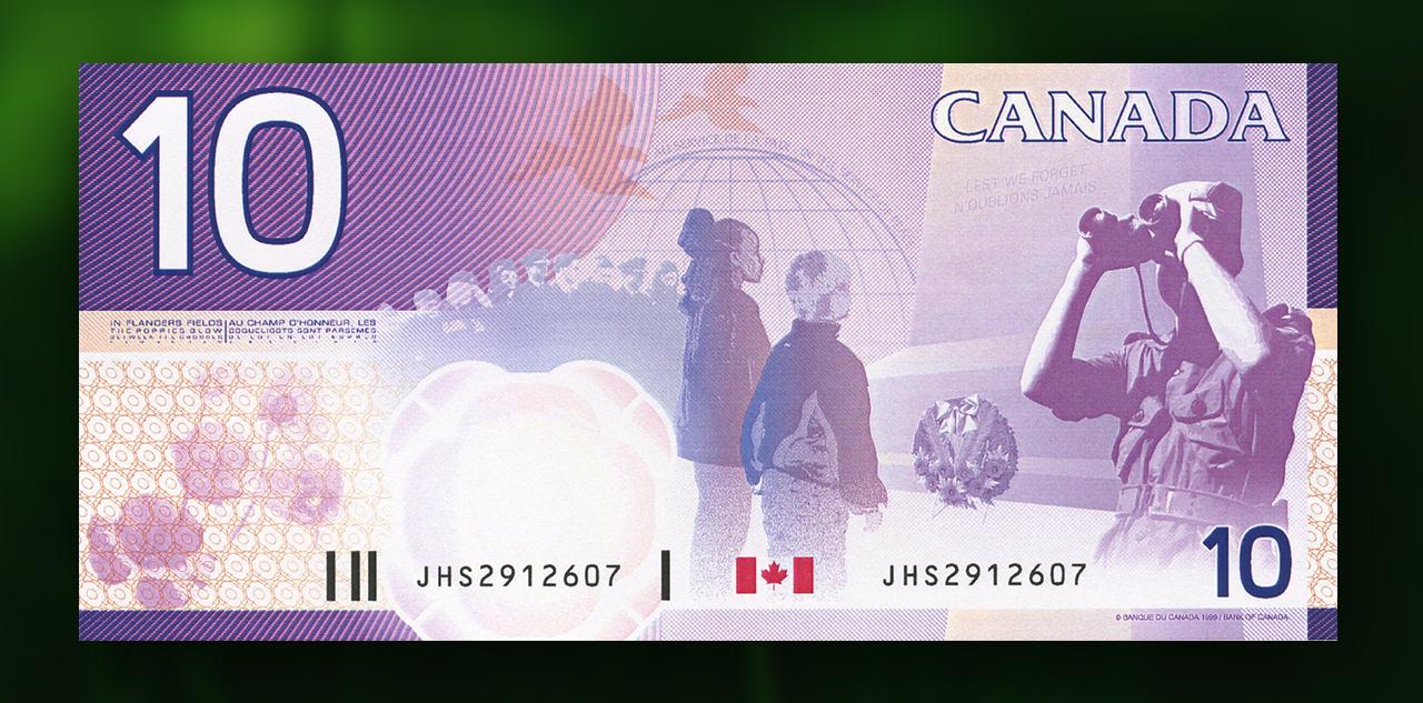
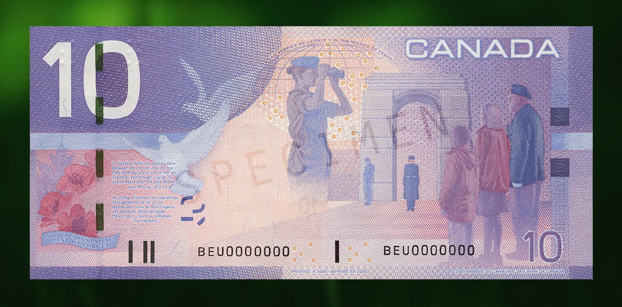


These note models, with the final version at the end, provide a glimpse into the highly detail-oriented process of evolving a bank note design. Three $10 bank note models, Canada, 1998 / $10, Canada, 2005
Timeless messages?
These notes were a major turning point in how Canada represented itself on money. And the vertical note? It doesn’t seem so radical now that the Bank of Canada has produced a fully vertical ten-dollar bill. Check it out—it’s a whole new direction both in design and content.
Though long out of production, the odd Canadian Journey series note may still occasionally pop up in your change. If so, take a close look at its multi-layered imagery and its messages about Canada and who we are as Canadians.
The Museum Blog
The Yap Stone Returns
By: Graham Iddon
A New Ten on the Block
By: Graham Iddon
New Acquisitions
By: Paul S. Berry
150 Years Since Confederation
By: Graham Iddon
Museum Reconstruction – Part 7
By: Graham Iddon


