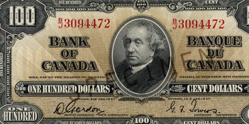
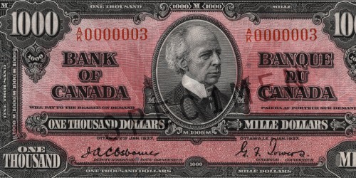
1937: The Bilingual Series

The glimmerings of a Canadian identity begin to appear in these bank notes, produced only two years after the first series was issued. The death of King George V, quickly followed by the abdication of his son, Edward VIII, prompted some quick re-designs, but the Bank took this opportunity to make some very formative changes. The portraits were limited to the King for all the common notes and Laurier and MacDonald for the big denominations. A pre-cursor to official bilingualism, government legislation decreed that Canada’s new bank notes feature French and English, changing the typographic approach. The portraits were moved to the centre, which made a symmetrical design appropriate to bilingual wording and kept the King’s face safely away from the inky index fingers of bank clerks. The designs were now more uniform across the series and a new, clearer colour was chosen for each denomination - a familiar colour scheme that, with variations, has since been used on all our note series.

The rear views of the notes remained fundamentally the same as the 1935 series with changes in colours and placements of numbers to bring more uniformity and clearer identity. The tight schedules created by the abdication meant that there was little the Bank could do to produce a completely new series. There would be time enough for that later.
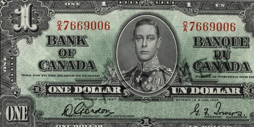
Bilingual Series $1 Note

The face of the $1 note was modified in 1938 to increase the width of the panel in which the signatures appeared by 2.4 mm, to counter earlier printing problems.

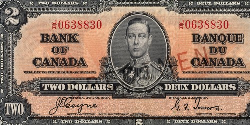
Bilingual Series $2 Note

The $2 note was printed by British American Bank Note Company in a new terracotta shade called “sanguine.” The back of the note carries the harvest allegory found on the back of the $10 note in the 1935 series and was engraved by Harry Dawson.

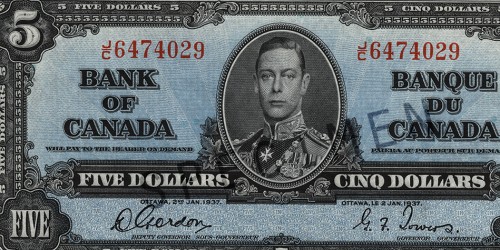
Bilingual Series $5 Note

The $5 note, printed by British American Bank Note Company, features the same image of electric power that appears on the back of the 1935 $5 note, but is blue rather than orange.

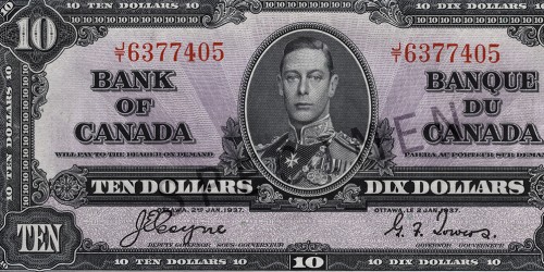
Bilingual Series $10 Note

Also printed by British American Bank Note Company, the back of the purple $10 note features the allegorical image from the 1935 $2 note, a winged Mercury representing transportation.

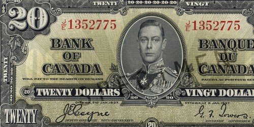
Bilingual Series $20 Note

Printed by Canadian Bank Note Company Ltd., the new $20 note was produced in olive green rather than rose pink. The fertility allegory from the 1935 $500 note appears on the back.

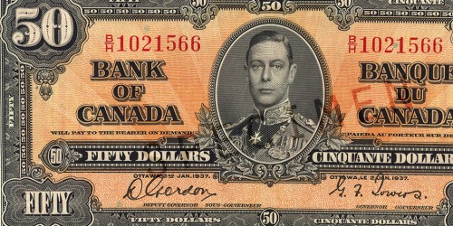
Bilingual Series $50 Note

The colour of the $50 note was changed from brown to orange, and the back features the same allegorical figure representing modern inventions that appears on the 1935 $50 note.

Bilingual Series $100 Note

The $100 note in this series is the same sepia tint as the 1935 $500 note, and the face features the same portrait of Sir John A. Macdonald.

Bilingual Series $1000 Note

The $1,000 note was issued several years after the rest of the 1937 series. It took on the rose tint of the 1935 $20 note but retained the portrait of Sir Wilfrid Laurier.