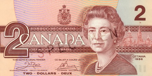
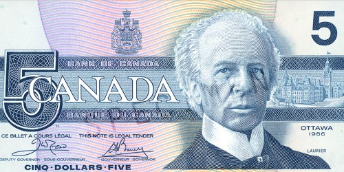
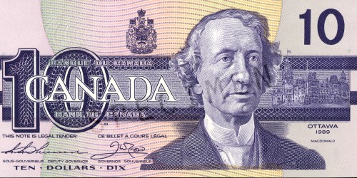
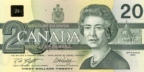
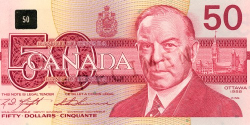
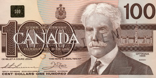
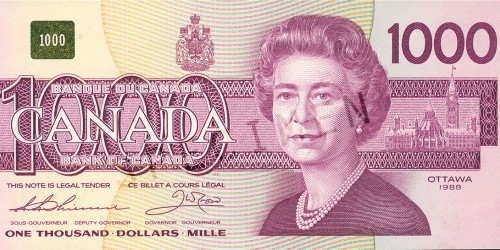
1986: The Birds of Canada Series
While the previous series was still in production, planning had begun for the Bank’s next series of notes. Technology was catching up to security printers in the form of accurate colour printing processes and by the early 80’s, colour copiers were an even bigger threat. This was one of the first bank note series anywhere to include a reflective, colour-shifting patch to combat photocopier use. The bills also contained internal identification features for the visually impaired, only readable by electronic means. The bill design itself also featured over-sized images and numbers for easy legibility. This was the last series to carry traditional looking ‘guilloche’ patterns (as seen in the numbers and bands on the front) which gives way here to more sophisticated micro printing of words or patterns appearing behind the main features.
It was decided to feature birds on the notes because of their political neutrality and for their visual simplicity. Unlike the traditionally complicated security printing style, it was decided that open, simple forms were more secure from counterfeiters as it was thought that imperfections would be more easily detected. Nature artist John Crosby was hired to provide the bird illustrations and to oversee the lithographers in the production of his work. Each bird species was chosen both for its pan-Canadian habitat and to compliment the colour themes of the notes.
This would be the first series without a $1 bill and the last series to carry the $1000 and the $2 bills.
