The Birds of Canada bank note series
Birds have appeared on currency for two millennia. And today, a number of nations feature birds on every one of their bank notes. But type “birds on bank notes” into a search engine and what flies to the top? The Birds of Canada series of 1986.

The eagle on this Phoenician coin represented immortality, power, strength and courage, while the Greek owl was about wisdom, prudence and protection from enemies.
Source: Shekel, Tyre, Phoenicia, Ancient Greece, 107 BCE | NCC 1969.23.126; Tetradrachm, Athens, Ancient Greece, 449–420 BCE | NCC 2000.40.106
Back in the 1970s
The bank notes of the Scenes of Canada series were complicated things and represented the latest in security printing technology. Their finely detailed vignettes, elaborate geometric patterns and multiple colours were designed to make these notes as difficult as possible to counterfeit. Indeed, each bill required from four to eight different printing plates. But technology was about to slip a new item into the counterfeiter’s toolbox—colour photocopiers. With one of those, a clever crook could deal with most of the Scenes of Canada security features with a single stroke.
While some denominations of the Scenes of Canada series were still in production, the Bank asked the security printing firm of Thomas de la Rue (now De La Rue) to begin planning a whole new note series that would counter this new threat.
Fine, feathered security features
The result was a complete about-face from the philosophy behind recent security printing. If photocopiers could easily handle the colours and elaborate designs of the current series, then the next series should be bold and simple—the better to spot the boo-boos that this new technology would inevitably make. In 1977, De La Rue provided its first design proposals, still with landscapes on the back. In 1983, much cleaner and simpler vignettes were suggested, ones with a single, large focal point—birds. They were beautiful, popular and extremely unlikely to generate controversy. Who could possibly have an issue with a bird?
Each bird and its accompanying background had to broadly reflect Canada, so nothing too specific to any one region was chosen. Though snowy owls are uncommon in southern Ontario and kingfishers are equally unusual in the North, the habitats of both are vast, big enough to represent much of the nation. And Canada geese and robins are as common as squirrels almost everywhere. The intent was for the birds to at least complement the colour themes of their chosen notes, if not actually match them.

In De La Rue’s first offering, you can clearly see the bones of the final note in the front design, but only “Canada” in the sky would survive from the back design.
Source: 50 dollars, model, Thomas de La Rue, United Kingdom, 1977 | NCC 1990.57.88
This is the first Canadian series that did not include a $1 bill. They wore out so quickly that it was cheaper in the long run to produce a coin.
Source: 2, 5, 10, 20, 50, 100 and 1,000 dollars, Canada, 1986–1990
The man behind the birds

John Crosby at his easel at the National Museum of Canada in June 1969.
Source: Courtesy of ©Canadian Museum of Nature, photographer unknown | Godfrey 35.tiff
John Crosby was a renowned nature artist best known for his strikingly lifelike watercolours of Canadian birds. Mostly self-taught, he worked for many years at what is now the Canadian Museum of Nature, producing illustrations of every sort of animal. In 1966, Crosby collaborated with ornithologist W. Earl Godfrey to publish The Birds of Canada, a magnificently illustrated reference book. Produced by the National Museum of Canada, now the Canadian Museum of Nature, the book brought Crosby’s extraordinary talents to the public’s attention.
Crosby was a natural choice to supply images for a new bank note series. In the end, he produced six of the seven illustrations required by the Bank. He rarely painted a bird without its immediate surroundings, but for the bank notes, a much broader, more distant background was required to suit the wide format. To give them more of a bank note appearance, each of Crosby’s images would be re-illustrated by an artist at the Canadian Bank Note Company.

The rear vignette of the $2 note began with an illustration by Crosby in grey tones. Engraver Yves Baril’s colour sketch is in the corner. The version below is Baril’s full-colour mock-up with all component colours listed.
Source: 2 dollars, drawing, John Crosby, Canada, 1985 | NCC 1991.50.10; 2 dollars, drawing, Yves Baril, Canada, 1985 | NCC 2012.66.1

Crosby’s and Baril’s illustrations could have been reproduced pretty much as they originally appeared. However, they were recreated using lines and dashes that resembled the printing style of the face of the notes—a look that had characterized bank notes for over a century.
Source: 2 dollars, Canada, 1988 | NCC 1986.42.3
A history lesson in the details
Despite the overall philosophy of using large, clear elements, the Bird series notes all carried some very subtle imagery—little gifts for the very observant. To the right of each portrait was a highly detailed little gem: a tiny image of the Parliament Buildings. Each view is tailored to suit the era of the person featured. Consequently, alongside Sir John A. Macdonald and Sir Wilfrid Laurier are images of the original 1862 buildings. There are even wee little historically correct flags (roughly 1 millimetre long) flying from the towers.
But while Sir Robert Borden was Prime Minister (1911–20), Centre Block burned to the ground. Though it might have thrilled historians, it would have been rather inappropriate to place an image of a smoking ruin next to Borden. Instead, the reconstructed Centre Block, begun while Borden was in office, is shown. As a historical compromise, the flag flying from the Peace Tower is the British Union Jack. That seems odd, but throughout the First World War, a Union Jack flew over Parliament to show solidarity with Great Britain.

Less than 3 centimetres wide, this view of the west end of the 19th-century Centre Block is extraordinarily detailed. Note the microprinting below the frame.
Source: 5 dollars, Canada, 1986 | NCC 1986. 20.3

When our sovereign visits Parliament, a flag called “the Royal Standard” (and not the Union Jack) is hoisted over the tower.
Source: 100 dollars, Canada, 1988 | NCC 1990.44.10
Hi-tech, 1986
These notes were far more technically advanced than the Scenes of Canada notes. As another defence against new and future imaging technologies, the large-denomination notes each featured a little metallic patch. Though highly reflective when seen from an angle, these optical security devices do not reflect light when viewed directly. So, when scanned or photocopied, the patch would show up as nearly black. The patches were a Canadian invention that a number of other countries later adopted.
On the back of the notes, the word “Canada” is not a solid block of type but is made up of hundreds of tiny, parallel lines. What appear to be empty areas of the notes are actually blocks of even tinier parallel lines that occasionally change direction. When copied with the scanning technology of the day, the lines tended to either distort or show up as a solid tone.

The patch looks innocent enough, but it was a complicated process to develop a flat surface that changed colour when viewed from different angles.
Source: 1,000 dollars, Canada, 1988 | NCC 1992.11.22

Even when digitally scanned with modern technology, these straight, parallel lines distort, forming wavy shapes called “moiré patterns.” This effect does not occur when a genuine note is viewed under normal conditions.
Source: 1,000 dollars, Canada, 1988 | NCC 1992.11.22
Accessibility also played a major design role. The portraits and denominations were bigger and clearer, and the colours much bolder. These changes were to make it easier for those with a visual impairment to distinguish the notes from one another. But technology also became involved in accessibility. To the right of the images of Parliament, little rectangles hung off the edge of the frame (see image below). When a note was inserted into a hand-held electronic reader, the device detected the rectangles’ format and location, and a voice simulator then “spoke” the correct denomination.

Following the Bird series, all Canadian bank notes have been “speakable.” An electronic reader is available for the public through the Canadian National Institute for the Blind.
Source: National Currency Collection
Apparently, even birds can generate controversy
The $1,000 bill was originally going to feature a spruce grouse, a chicken-like bird found all over Canada. But this turned out to be a risky choice. It seems that the spruce grouse is more of a pedestrian than an aviator and its prime defence against becoming some predator’s dinner is to simply stand still in the hope of avoiding attention. However, this makes hunting them dead easy for humans, leading Newfoundlanders to nickname them “fool hens.” That ruined any chance of bank note celebrity for the spruce grouse, so an entirely inoffensive pair of pine grosbeaks was substituted. (incidentally, the only image not originated by Crosby)
But what if you have problems with birds altogether—even grosbeaks? It seems the Bird series was a bit of an issue for those Canadians with ornithophobia. Some folks have a bird phobia that results in anxiety and even some physical symptoms. Former Bank of Canada Governor Gerald Bouey received a letter concerning just this affliction from a very outraged citizen. It seems his wife was so ornithophobic that even images of birds caused her problems. “How could you be so thoughtless?” he wrote.
Will the real Canada goose please stand up?
In their day, the Birds of Canada notes were some of the most advanced in the world. Yet, the most successful counterfeiting attack in Canadian history was made on the Bird series. In the late 1990s, Wesley Wayne Weber used early photo-editing software and a desktop colour printer to produce his own version of the $100 bill. He created a believable foil optical security patch and even applied the little dots that glowed under ultraviolet light. His counterfeits were so good, and there were so many in circulation, that many Ontario retailers simply refused to accept $100 bills. Weber passed at least $5.5 million worth of dodgy bills into the economy—and those are just the ones the RCMP managed to seize! Weber 100s still occasionally pop up, even after 25 years.

When seen next to a real note, it’s fairly clear that the top note is the Weber fake. But what if you were a harried clerk in a busy store?
Source: 100 dollars, forgery, Canada, 1988 | NCC 2016.40.4; 100 dollars, Canada, 1988 | NCC 1990.44.10
On the cusp of change
This bank note series has a number of firsts to its credit, but also a number of lasts. Guilloche, the machine-made geometric patterns you see in long strips on the face of the note, had its Canadian swan song on this series. This was also the last time the main face pattern was printed with intaglio engraving—a process where an artist hand cuts the image into a steel plate. Nowadays, only a few items, mainly the portraits, are engraved.
The Birds of Canada bank notes were conceived, designed and produced during a bit of a watershed moment in security printing. New security technologies were fast emerging while, at the same time, digital technologies were putting some serious tools in the hands of counterfeiters. These bright, bold and simple notes are still very popular with Canadians. Birds just seem to appeal to everyone. Except for the ornithophobes, of course.
Content type(s):
Blog posts
We want to hear from you! Do you have an idea for a blog post you’d like to see?
The Museum Blog
Speculating on the piggy bank
Ever since the first currencies allowed us to store value, we’ve needed a special place to store those shekels, drachmae and pennies. And the piggy bank—whether in pig form or not—has nearly always been there.
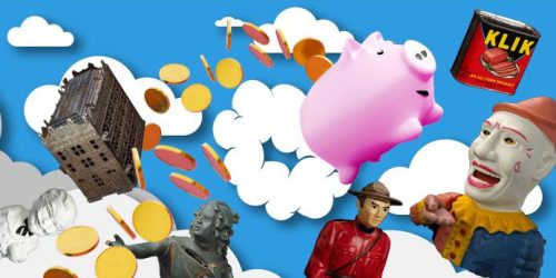
New acquisitions—2024 edition
Bank of Canada Museum’s acquisitions in 2024 highlight the relationships that shape the National Currency Collection.

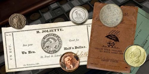
Money’s metaphors
Buck, broke, greenback, loonie, toonie, dough, flush, gravy train, born with a silver spoon in your mouth… No matter how common the expression for money, many of us haven’t the faintest idea where these terms come from.