An exercise in restraint: The 1938 building
Old bank buildings look like, well, old bank buildings. There are always a few scattered around the downtown of every Canadian city, vaguely resembling Greek temples or Roman baths. While so much of Canada’s eccentric Victorian charm has been lost from our city streets, the old bank buildings somehow manage to survive. Perhaps the very strength and power these structures were meant to evoke has served as a charm against destruction. Many are still banks, but others have become the homes of restaurants, tourism offices or even health clubs; one especially ornate example is now home to the Hockey Hall of Fame in Toronto.
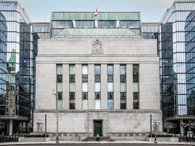
While it hasn’t a forest of classical columns, there is little doubt the Bank of Canada’s original 1938 head office is an old bank building. But, unlike most Canadian citadels of commerce, its most striking characteristic is restraint. Its understated, bank-like style is characterized as “stripped classical.” The classical features are there, but they are mere architectural references, the columns a suggestion rather than a statement. It’s rather a polite building, really.
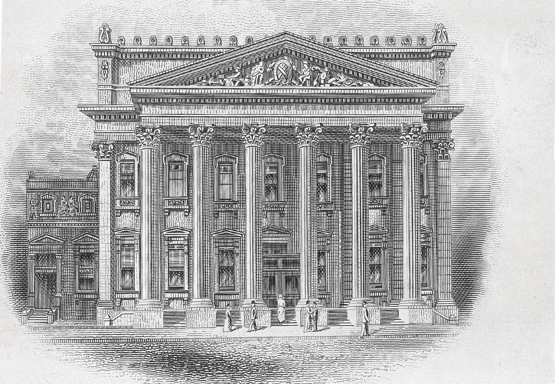
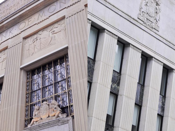
The original building’s design philosophy owes a lot to the era during which it was built: the Great Depression. Contrast the Bank of Canada building with the Bank of Montreal building down the street. Designed in the roaring 20’s, its classical styling is of the same school as the Bank’s, but more detailed and ornamented, more ostentatious.
Despite its restraint, the Bank’s old head office has a story to tell, its own messages to convey. It is a solid, heavy, granite cube expressing strength, stability, reliability, permanence and a little austerity. It’s how the Bank wishes to be seen by the public. But its appearance also imparts some of its economic philosophies. The call for a building of its own—one that also projects its values and its character—goes right back to the Bank’s inception in 1935.
When the Bank of Canada first began operating, it occupied rental space in the Victoria Building a few doors east of its current head office. But you couldn’t have a nation’s central bank working out of a mere office building: it needed a presence. So, it acquired an address in the appropriate neighbourhood—on Ottawa’s Wellington Street, a stone’s throw from Parliament Hill.
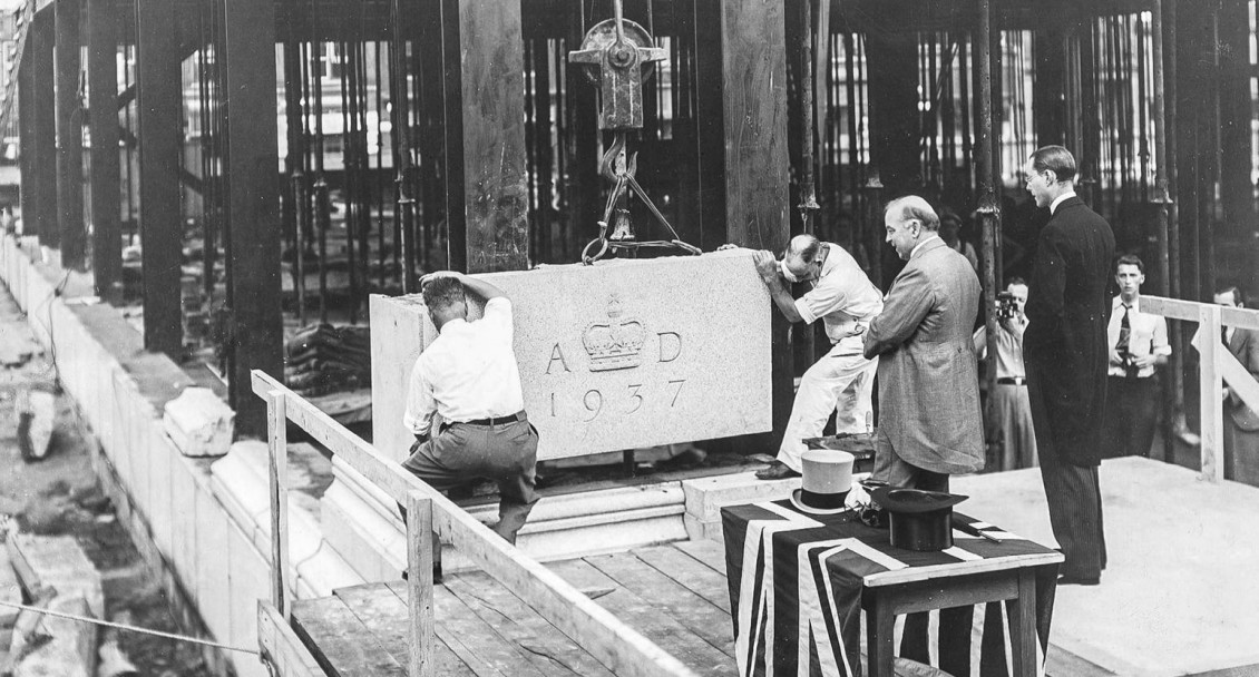
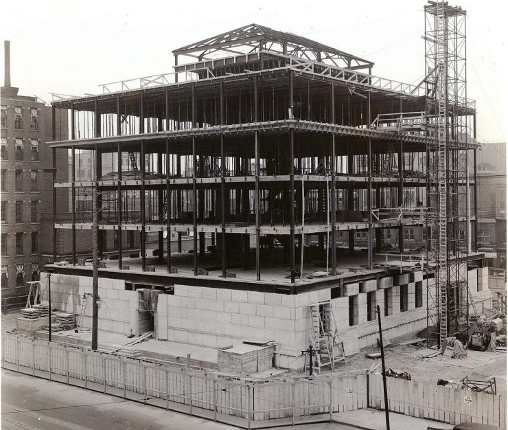
Sumner G. Davenport, an architect responsible for some of the Royal Bank’s buildings, was hired as a consultant for the new building. He chose the firm of Marani, Lawson and Morris which provided a number of ideas. Of course, a few designs had to be rejected, such as the one Deputy Governor J. A. C. Osborne described as resembling “a flowerpot in its saucer.” A much more satisfying design was finally chosen—one that would complement and not overshadow the neo-Gothic buildings of Parliament Hill and the Château-style of the Confederation Building across the street. The cost of construction, including the land, was $1.1 million—a boon for the Depression-era building trade. Construction began in early spring 1937 and was completed in just 13 months. In 1939, the Bank’s new head office was awarded the Ontario Association of Architects’ Gold Medal.
Allegorical decoration
While the architect’s restraint is apparent, the outside of the 1938 structure does still include a number of significant decorative features. Between the “columns” of the façade there are seven bronze allegorical figures, each affixed to its own square of dark blue/green marble. Demonstrating the restraint so typical of the whole building, each figure nearly disappears into its own background. They were created by Anglo-Canadian sculptor Jacobine Jones and helped establish her reputation as one of Canada’s pre-eminent architectural sculptors. The figures are, typical for a bank building, allegories of those things that build commerce and an economy: trades, resources, and industries.
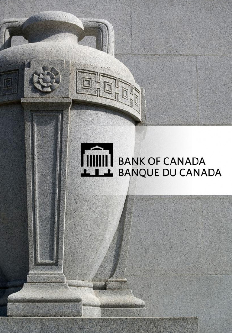
The building’s most obvious decorative feature is a pair of enormous stone urns, one sitting at each end of the terrace above Wellington Street. These are meant to represent the storage of wealth. Urns have been used for centuries to store grain and oil and are a fitting symbol.
A successful architectural marriage: the 1979 expansion
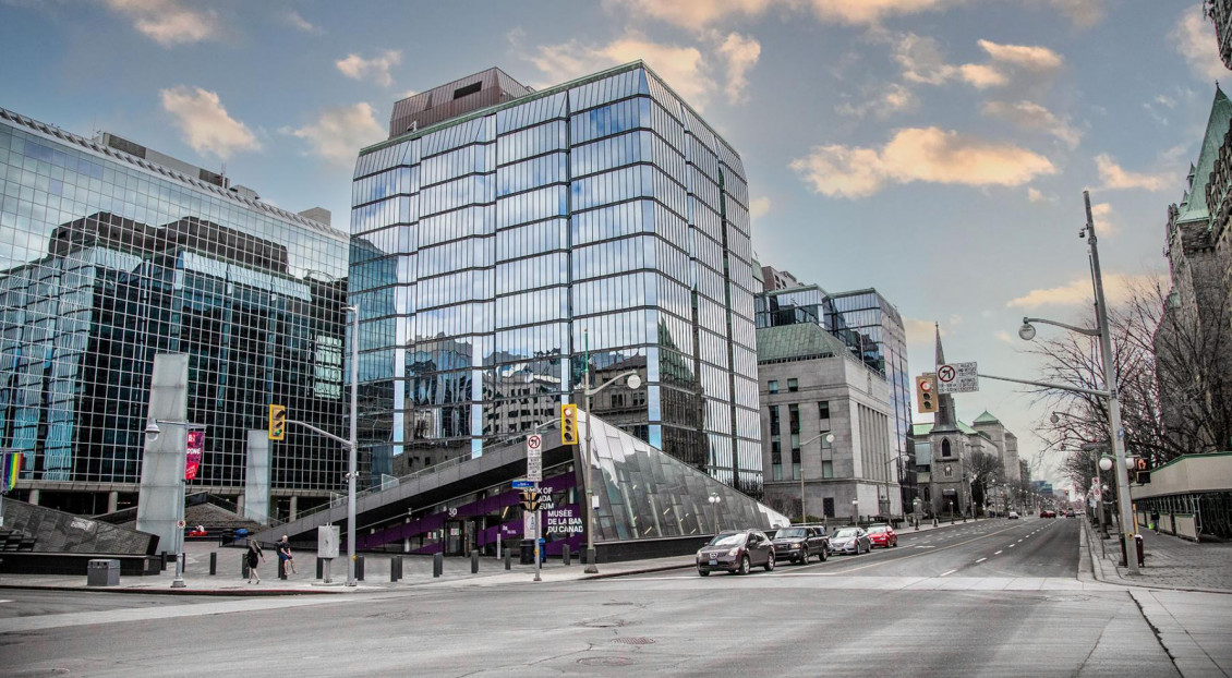
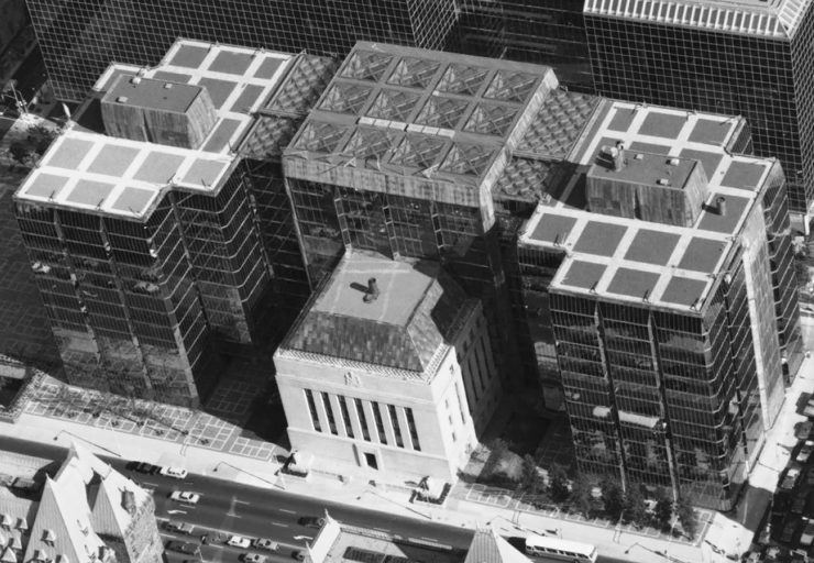
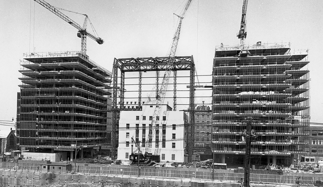
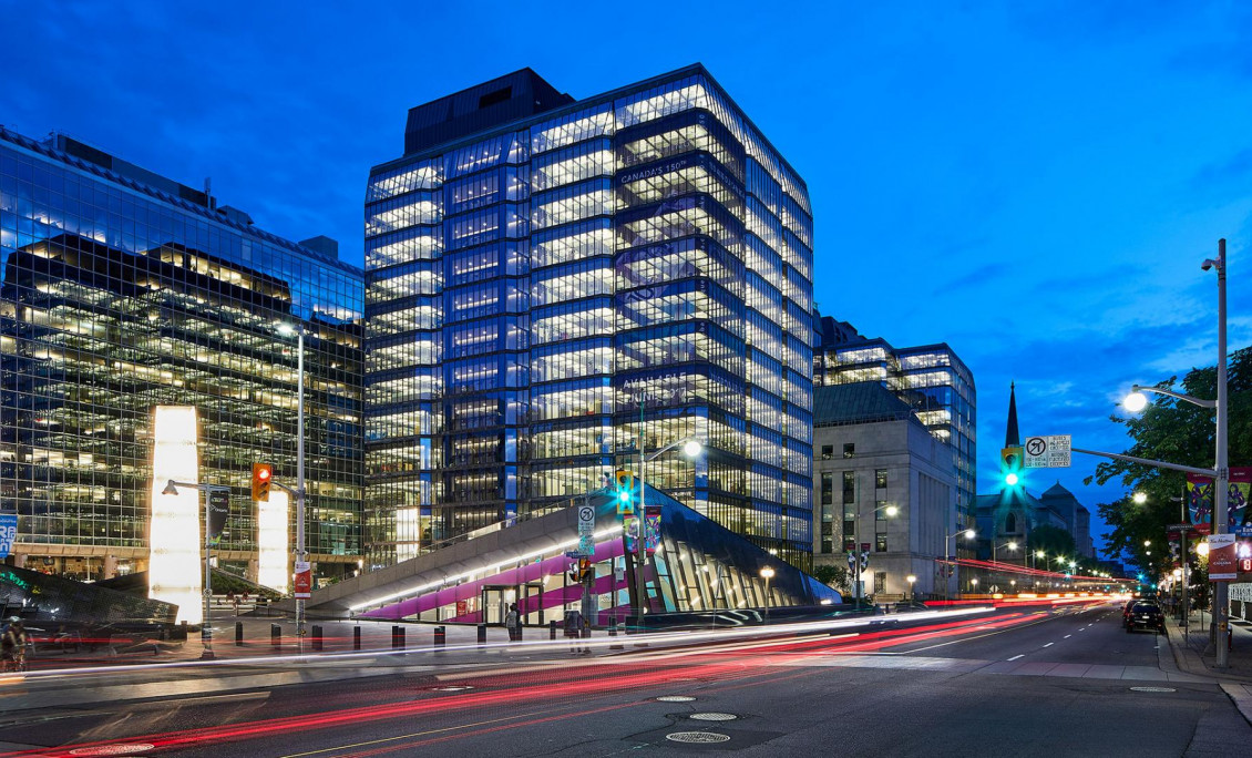
The Bank of Canada’s head office is in fact four buildings, not two. Admittedly, it’s hard to tell, unless you view the whole complex from the air. What appears to be a single building that wraps itself around the original 1938 head office is actually two entirely self-contained glass towers with a third building uniting them. And the third building is really 12 stories of empty space, the spectacular atrium.
Building a modern addition onto an iconic heritage structure is a tricky business. In the early 1960’s, as the Bank continued to expand, it invited proposals for an expansion to its head office. One plan was an imposing (and maybe a bit threatening) two-block-wide expansion of the original building, maintaining its style. Another involved roofing over and enclosing the entire street behind the Bank. The Bank was fast running out of office space when it approved an elegant and airy concept submitted by one of Canada’s most celebrated and world-renowned architects, Arthur Erickson. Construction began in 1972 and was completed in 1979.
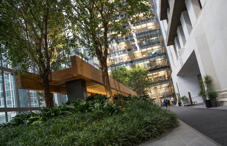
On paper, these towering walls of glass would seem like a jarringly modern imposition that could overwhelm the neat little cube that was the Bank. Far from it. The expansion has been hailed as one of the most successful marriages of historical and modern architecture. If anything, it made the original building appear more reassuringly solid and significant, with the new buildings acting as an elegant backdrop standing discreetly behind it. The old granite cube appears to emerge from the new towers as if coming out of a forest. Erickson’s atrium—an example of his fascination with integrating buildings and nature—enclosed the back of the original building in a lush indoor garden. Where a natural landscape could not be found, Erickson created one.
Renewing the legacy
When, in 2010, a magnitude 5.0 earthquake revealed weaknesses in the head office complex, the Erickson buildings were more than 30 years old and the original building more than 70. A major renovation was started in 2013. The renovation team brought the buildings up to code for earthquake resistance, installed leading-edge heating and ventilation systems, brought green technologies to the lighting and electrical network and created modern communications infrastructure. As a matter of fact, the Bank’s renovation achieved a gold rating in LEED: Leadership in Energy and Environmental Design. The renovation also restored Arthur Erickson’s original vision of light-filled, open-concept workspaces with unrestricted views of Ottawa’s historic core. Over the years, corridors and interior offices had sprung up, cluttering this vision. It turned out to be quite easy to align the interior renovations with current thinking on collaborative office space design because the far-thinking Erickson had already been there—in 1971. Passersby can see this significant aspect of the renovation from the street as daylight fades to reveal the airy open office spaces.
If you are in Ottawa, drop by and take a look at this remarkable complex. But there’s no hurry, it’s going to be there for a very long time.
The Museum Blog
New acquisitions—2024 edition
Bank of Canada Museum’s acquisitions in 2024 highlight the relationships that shape the National Currency Collection.

Money’s metaphors
Buck, broke, greenback, loonie, toonie, dough, flush, gravy train, born with a silver spoon in your mouth… No matter how common the expression for money, many of us haven’t the faintest idea where these terms come from.
Treaties, money and art
The Bank of Canada Museum’s collection has a new addition: an artwork called Free Ride by Frank Shebageget. But why would a museum about the economy buy art?
