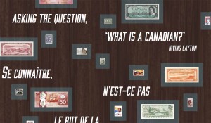
What will Voices from the Engraver look like?
The design of any exhibit is really where the tire hits the road. There could be beautiful artifacts and fascinating writing but if the exhibition looks like a grade 9 science fair booth, (unless it’s the one with the working volcano) nobody’s going to bother taking a look. In our case, we brought our designer in during an early conceptual phase when we were working out the subject zones of the storyline. Maps of this were created then we could begin to brainstorm the actual physical aspects of it.
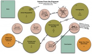
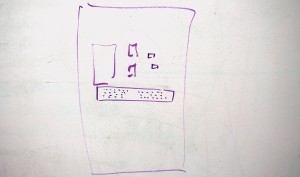
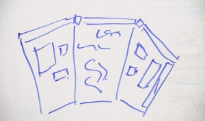
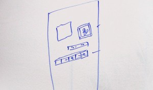
This is not the time for ‘nay sayers’. Basically, we planned a luxury car knowing that when all was said and done, it was going to be a very nice family sedan (maybe with the big engine?). Grandiose ideas unfettered by the petty constraints of budgets (and to some degree, reality) were thrown about. Inexplicable diagrams sprawled across white boards and soon our designer had his starting point and he could go away and design the look of the exhibit.
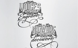
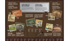
And he did go away - to his basement where nobody was going to drop by his desk to chat about last night’s episode of True Blood or ask him to re-establish their network connection. From out of his basement he came up with the look of the exhibition in a few days and remarkably little has changed since (until the budget says we can no longer use those fur-trimmed, platinum frames on the stand-up panels). So what will it look like? Well, our designer took all of his cues from bank note and stamp design as well as the tools and plates of engraving. The typography and design details are bank note in style, the panel look is derived from engraved printing plates and the dark wood of a workbench and a well-used tool handle.
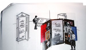
There are two basic display units in this show. The vertical panels are planned as connected groups of three that can be displayed as a roughly curved group all facing one way or facing three directions in a triangle. The smaller exhibit sections, what our interpretive planner calls ‘exhiblets’, are built into low units resembling antique drafting tables. They will have not only 2D items and labels in them but a scattering of engraving tools and related props. As well as label information, the stand-up units will have 3D elements such as bank note or stamp frames and built-in acrylic cases in various sizes for a small variety of artifacts. Take a gander.
There are a number of touch-screen electronic interactive items in this show as well which we will cover in some detail in a following episode of ‘The Adventure of Exhibit Planning’.
The Museum Blog
New acquisitions—2025 edition
Whatever happened to the penny? A history of our one-cent coin.
By: Graham Iddon
Good as gold? A simple explanation of the gold standard
By: Graham Iddon
Speculating on the piggy bank
By: Graham Iddon
